In this assignment we(students) are asked to choose one of the following products, and create a name and a logo for this product:
- A new cereal
- A new chocolate bar
- A new coffee
I chose (a) A new cereal, cant really say why but I guess it will be much more easier for me because I did something similar (A new rice packaging) recently. The only difference is that I didnt digitize it in adobe illustrator.
The brief goes as follows:
The requirements for the logo are:
- It should be simple and easily recognizable.
- Timeless, and preferably not more than 2-3 colors.
- It Should contain a symbol / figure / ornament, and a title (name / brand)
As the brief suggest, simple and easily recognizable. ImmediatelyI tried to visualize the finished product in my mind and 3 things came to mind,
- a catchy name for the product
- readability
- vibrant colours
The later is important because of the target consumers being mostly kids and the youths. So it has to be attractive as well as easily recognizeable.
Research
So I did some research on the net and stores to get a feel of things.
Below are some images that inspired me.

In the past cereal packaging were not as vibrant as they are today. For example, Kellogg’s, a household brand has been producing cereal since 1906 continually improved its product line and packaging techniques to meet the needs of an ever-changing and evolving consumer base. The co-inventor of flaked cereal was Will Keith (W.K.) Kellogg along with his brother, Dr. John Harvey Kellogg. At that time there was a shift in the eating habits of Americans rom heavy, fat-laden breakfasts to lighter, more grain-based meals. So my challenges were to create cereal product logo that should catch the eye of the target consumer, kids, youths and adults that love a light breakfast.
The name of the product:
I thought what I might call it and affter delibrating a some choices, I finally settled for “Chunkies” (at this point I dont think I have seen a cereal with that name). I think it is a catchy name for the product(exciting as well) and something kids wont find it hard pronounce.
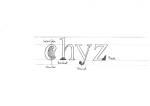
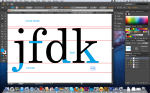
The next thing was looking for a font/typeface that will best suit the purpose. I needed a bold, playful and italicised font. A sans-serif font.

I sampled Komika Axis(regular), Noteworthy(Bold), Japan(regular), Cooper Std.(Black italic) and others. I finaly decided to use Komika Axis(regular) in small caps to give more emphases.
I needed a symbol to blend with the name. I chose a wheat stalk. I did a few sketches of it. The next challenge is to digitize it in adobe illustrator. It took quite some time to put together. I realized that as I spent more time on perfecting the illustrations I got better and hence the final product. I hope you like it.
I hope you like my final product.


This slideshow requires JavaScript.