Activity:- Define the Gestalt Theory in your own words.
Page through a magazine or newspaper or browse the Internet and find a different logo for each of the Gestalt principles. Explain in your own words, which logos are showing which principles, motivate your answer.
Find examples of four themes of thinking, and explain your choices.
Gestalt Theory:- Can be defined as the human perception of whole image instead of just a collection of simple parts.
Logo examples of Gestalt principles:-
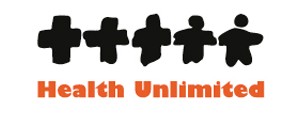
Proximity
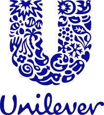
Logo example of Law of Proximity
This occurs when we perceive a collection of objects as forming a group as in the example above. The placement of the different shape elements in a way that it forms the letter “U”
Similarity
Logo example of Law of Similarity
This captures the idea that objects/elements will be perceived as belonging to the same group or are similar to each other. Similar shapes and the solid black causes our mind to view the logo as a whole.
Symmetry
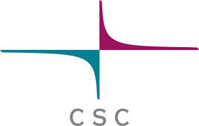
Logo example of Law of Symmetry
This occurs when we tend to perceive objects as symmetrical shapes that form around their center. In this case the logo above is perceived as an integral whole although the two constituent geometrical shapes seem to be pointing in different directions and have differing colours.
Closure
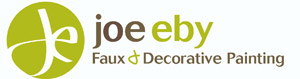
Logo example of Law of Closure
This captures the idea that we perceptually close up, or complete, objects that are not, in fact, complete. In the above case we perceive the ‘J’ although the shape we see appear to blend with the white space outside the green circle.
Figure/Ground

Logo example of Law of Figure/Ground
This captures the idea that in perceiving a visual field, some objects take a prominent role (the figures) while others recede into the background (the ground). In this case the running plumber takes a prominent role while the plumb is formed by the negative space.
Common fate
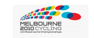
Logo example of Law of Common Fate
We perceive items or objects moving (or appearing to move) in the same direction as related to each other, more so than elements that are stationary or appear to be moving in different directions. The coloured circles appear to move in the same direction from the left to the right perspective.
Four themes of thinking
KISS
Keep It Short and Simple, or Keep It Simple Stupid (KISS) is a modern acronym but it employs the same tenets as Ockham’s razor, which has been around for several hundred years. The idea is to pare back a design to its essential elements, something that requires a clear understanding of the message that has to be communicated and the audience it is to be directed towards.
Keep it short and simple
Focus
Select only the key message elements as the focus for the design. A company may have many products or projects but the design should focus on the most important ones. Information about other aspects of the company can be provided via other communications such as printed materials, brochures or the web page.
Focus design
Text minimization
This can be any form of design that minimizes text to the barest minimum while delivering the set message.
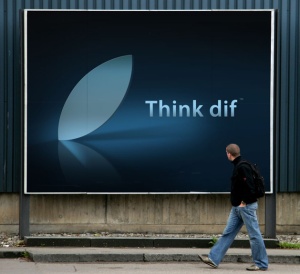
Text minimization
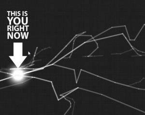
White space
Oftentimes, white spaces are overlooked. It is even known as a negative space which refers to the open space between design elements. These are the spaces not occupied with text, images or other visual elements. But it doesn’t mean that negative spaces are all white in color. If we go back to the description, it refers to a SPACE regardless if it is white or not.
White space